| ||
| NHL - New York Islanders - Mid 90's |
It's common for logos to be intimidating. In all likely hood, it's never going to throw a professional athlete off their game though. They don't go into the arena saying "Oh man, they must be good. They've got a badass and scary looking caricature on their jersey. We're going to lose."
Regardless, it gives the teams brand a good image and one that their fans can be proud of. However this one doesn't help the Islanders look at all. First of all, the bottom stripes look like something that my one year old cousin would be able to draw. I'm sure any graphic designer would make a comment on the colors. Something like "What were they smoking?"
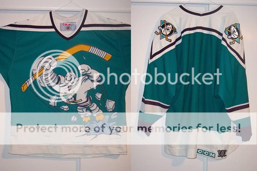 |
| NHL - Anaheim Mighty Ducks - 95-96 |
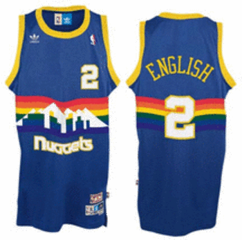 |
| NBA - Denver Nuggets - 1981 - 1993 |
This is a long time to have a jersey like this. I'm not exactly sure what the rainbows represent.
And here's some more for your enjoyment!